QR Code Design Guide: 15 Ideas With Scannable Examples
15 QR code design ideas with downloadable examples. Learn where to put color, logos, frames, and text while preserving a readable pattern.
Start a QR design with a working destination and a plain code that scans. Then change one thing at a time: color, surrounding layout, frame, or logo. Keep the original nearby so you can tell whether a design change made scanning harder.
Below are fifteen ideas for the code and the printed material around it. The five color samples are working demonstration codes that open the QRBliss generator. They have been decoded in software; you still need to test your final design, printer, and devices.
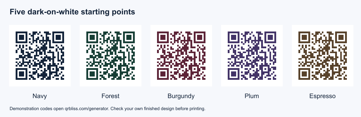
Fifteen QR code design ideas
1. Navy modules on white
Use a dark navy for a restrained brand palette while leaving the background white. It can sit comfortably on a professional handout without introducing another bright accent. Download the navy example (SVG).

2. Forest green with a separate brand label
Keep the pattern dark and place the business name underneath, outside the margin. The label can explain the destination without interfering with the scan. Download the forest example (SVG).

3. Burgundy on an uncoated-card layout
A burgundy pattern can carry a warmer identity. The downloadable sample is still on white: if you print it on colored or textured stock, that is a different design condition to test. Download the burgundy example (SVG).

4. Plum in a simple square panel
Use the panel as a stable area within a busier poster. Keep photography, decorative rules, and the caption outside its white border. Download the plum example (SVG).

5. Espresso beside a product illustration
Put a dark brown QR beside the drawing rather than over it. This gives packaging a coherent palette while keeping the code's background predictable. Download the espresso example (SVG).

6. Bright color in the surrounding frame
When a brand relies on pale yellow or a bright pastel, use that color in the outer layout. The QR can remain dark-on-white inside it. Keep enough separation that the frame does not become part of the pattern's clear margin.
7. A destination-first headline
Set “View the menu” or “Open the care guide” above the square. This makes the sign easier to understand at a glance. Pick wording from the call-to-action library that matches the page you actually link to.
8. A small brand mark beside the code
Putting a logo next to the QR avoids covering its data. Align both elements on a shared baseline or within a panel, and keep the logo outside the clear border. This is a useful first option before trying an embedded logo.
9. A restrained central logo
If you place a logo inside the QR, use a simple mark and compare against a version without it. Keep the corner finder patterns intact and test the complete export. There is no universal safe logo-area percentage for every payload and design.
10. A numbered event card
Add a large station or table number outside the QR area. The number helps people navigate without scanning and makes missing cards easier to identify. The scavenger-hunt pack uses this approach.
11. A readable address below the code
Offer another way to reach the destination for someone who cannot scan. Use a URL you control and have checked. Do not show a short address that leads somewhere different from the QR.
12. A two-sided care card
Keep essential handling information on one side and a QR for a fuller guide on the other. The code adds detail without turning the printed card into an unexplained square. See the packaging examples.
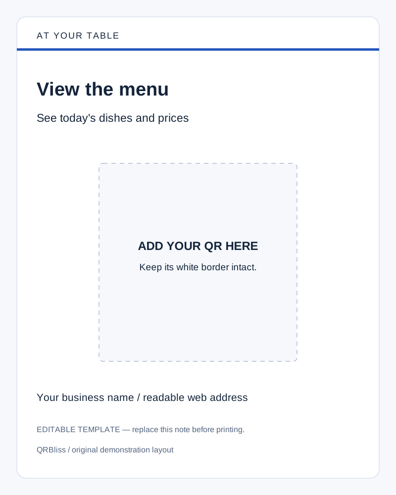
13. A table sign with one action
A holder gives the code a more predictable viewing angle than a flat sheet under a plate. Use one clear task and inspect the sign from a seated position. Download a menu sign layout (SVG) to customize.
14. A window sign with a solid backing
Avoid assuming the inside of a shop will provide a consistent background through glass. A backing panel can separate the code from movement and changing light behind it. Test from the outside where a visitor stands.
15. A consistent family of signs
Use the same typography and spacing across menu, booking, and feedback signs, but give each a different action sentence. Keep the destination next to the filename in your working folder so matching designs do not lead you to print the wrong code.
What must stay readable
The three large corner patterns help locate the symbol. Keep them visible rather than turning them into decorative marks. Preserve a clear four-module margin around a standard QR; the margin grows with the module size. DENSO WAVE's layout guidance explains the code area.
Dark-on-white is a useful starting point for testing because it removes a source of color ambiguity. A numerical contrast check cannot certify real-world scannability. Transparent backgrounds, inverted colors, gradients, reflections, and printer differences all deserve their own test.
Error correction restores some damaged data. It is measured in codewords, not a guarantee that a logo may cover the same fraction of any QR image. Higher correction can also make the pattern denser. DENSO WAVE's error-correction explanation describes that trade-off.
Size the final layout, not just the source file
An SVG can keep edges sharp while resizing, but it does not make a physically tiny pattern easy to read. A PNG can work well when its resolution and printed dimensions are appropriate. Keep both square and leave the margin intact.
Use the print-size guide for module calculations and proof checks. A shelf label, window sign, and billboard should not share an untested minimum-size rule.
A quick design review
Check the final destination, caption, contrast, corner patterns, and margin. Export the finished code, place it in its actual layout, and scan that version. If it fails, compare it with your plain baseline and remove one styling change at a time. The troubleshooting guide helps isolate the cause.
The downloadable color samples point to QRBliss for demonstration. Replace that destination with your own before using a design for customers. Create your own branded QR code.
Frequently asked questions
What are QR code design patterns?
Are there design guidelines for QR code icons?
Can I put a logo or a design in the middle of a QR code?
Can a QR code be circular?
How much of a QR code can I change before it stops scanning?
Create your first QR code.
Free tier. No signup required to start. Dynamic codes included.
Make a QR →